

Ally Credit Card
Rebranding an existing credit card to new audience.
What did I do?
For this this project I designed a complete end-to-end user experience for the Ally Credit Card, in an updated style, working closely with business stakeholders.
Learning the Product
When Ally acquired the Ollo Credit Card, they gained an existing customer based that needed to learn how to use a new app. Working closely with our business partners, I studied the Ollo user persona and their pain points. Learning the reasoning behind the design of the Ollo card’s existing user interface, would be crucial to successfully migrating those users to a new experience with Ally.
Over time, as our team became better versed in the persona of a credit builder, we were better equipped to design a thoughtful experience which embodied the Ally tone and voice, while embracing this user’s unique relationship to credit and personal finances.

Key persona learnings:
Average credit limit of $1,200.00
Uncomfortable with autopay, prefer to scheduling individual payments
Likely to pay on time when able to adjust due date
Checking out the Competition

As I became familiar with the existing Ollo user experience, and the thought behind the design, I wanted to see how their approach compared to other credit card providers, including those who offer credit cards only and those who have credit cards in addition to traditional bank products. Working closely with our research team, we began to break down some of the commonalities and differences in the market.

Key learnings:
Balances and due dates should be clearly visible and easy to identify throughout the experience
2% cash back is the most common and sought-after card reward
Entry points to account management, card management and credit scores vary among competitors
Priority of card art varies a lot in the market
What goes where?

As I started to ideate on the new user experience, it became apparent that one of the biggest shifts would be moving away from the Ollo app’s use of a hamburger menu as the main navigation, something which is not utilized in Ally’s mobile app.
In the Ollo app, users normally opened the hamburger menu to find a full list of all destinations within the experience, each with it’s own screen. To better align with the current Ally experience, I knew I wanted to combine some of these task entry points into common groups, before solidifying a new navigation pattern.
Working closely with our research team, we conducted user tests, including a card sort, to make sure our groups, and their names, aligned with user expectations.
Key learnings:
User expectations aligned closely with our hypothesis and we were confirmed in moving forward with entry points for a group of card management tasks and a group of payment tasks.
-
![]()
Mapping it out
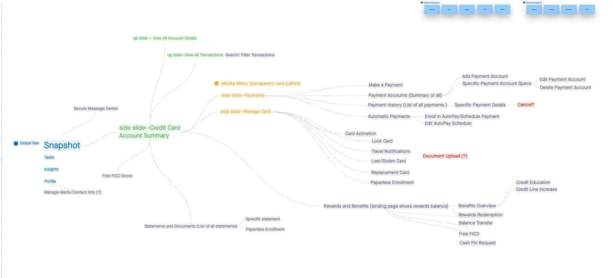
After confirming the navigation approach with research, I began to map out the pathways for the new credit card user experience.
-
![]()
One location, multiple tasks
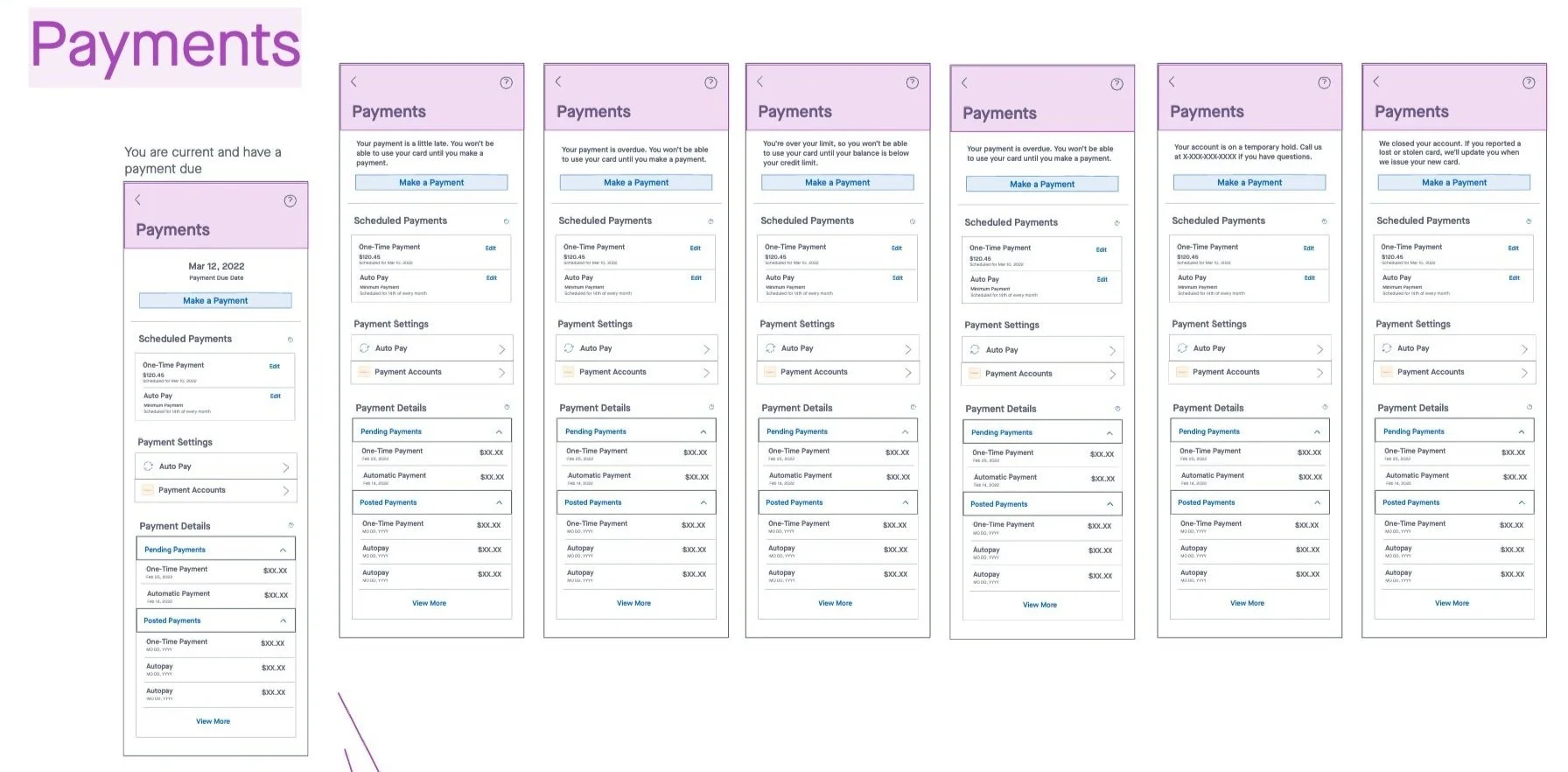
Following testing, I began to sketch out what hub for payment related tasks would look like, with a focus on prioritizing the most important information and tasks before the scroll.
-
![]()
Completing key tasks quickly
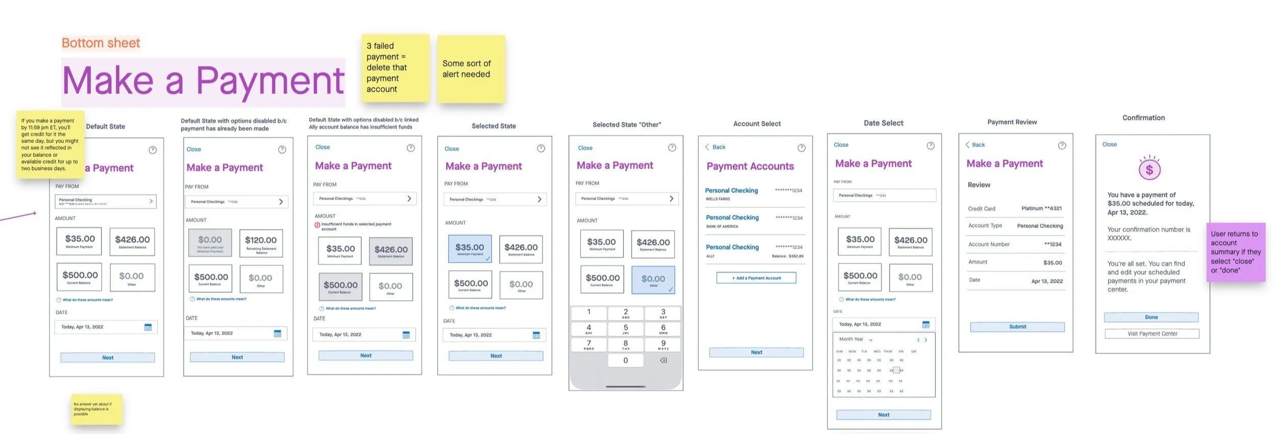
Combining competitive research with knowledge of the credit builder persona, I began to sketch out a Make a Payment flow with built-in default selections for some form fields, to make this a two tap task for some users.
Opportunity for a new UI
While working on this project, Ally digital product leadership expressed an interest in the mobile team beginning to refresh the app experience. Working with our Design Ops team, I began to explore a more modern design for the app.
-
The existing color palette for the Ally mobile app included a lot of purple and plum gradients to anchor users back to the Ally branding, while still using blue for all links and buttons.
Taking inspiration from financial apps like Chime and Sofi, which embrace a more limited palette, and utilize more white space, I shifted to using the Ally brand colors for links and buttons.
This pivot allowed users to still feel connected to the brand they know and love, while streamlining the amount of colors on the screen. -
Drawing inspiration not just from other financial institutions, but also from other well received apps, like Airbnb, I softened the corners of containers and buttons and added additional padding between elements on the screen.
While there was some concern about the length additional padding would add to the full screen, our research confirmed users expect to scroll in a mobile experience. This allowed us to embrace the move to additional padding and give users a chance to really focus, without a cluttered viewport. -
As previously mentioned, I knew we would be looking to create a new navigation experience for users, at the account level, and move away from the previously used hamburger menu.
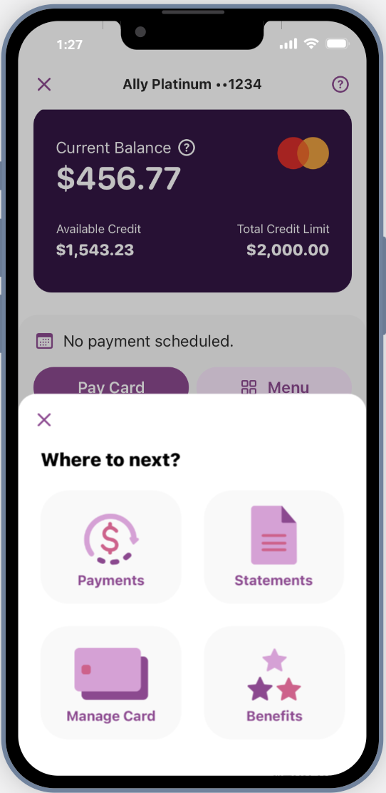
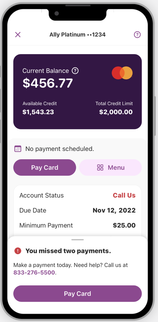
This project set up new navigation patterns, at the account level, for our mobile app.One, was that each account would have a primary button devoted to the most common task for that account, close to the top of the account screen, in this case, “Pay Card”.
The other new pattern is that beside that primary button would be a secondary “Menu” button with entry points to hubs for tasks related to that account. While we did research on several names for this button, including “Tasks” and “Actions”, ultimately “Menu” resonated most with users.



Keeping the user informed
Keeping the informed on their payment status, was critical to building the experience. The persona of the credit builder is someone who has to make tough choices when it comes to picking which bills to pay and when. I wanted to make sure users didn’t have to search too far for top details like due date, minimum payment, and scheduled payments.

In designing missed payment alerts, the content designer and I worked to make sure the messages reflected the escalating importance of the situation, while still being empathetic.
As users miss more payments, the messages are no longer dismissible, but they can be minimized to allow user complete other tasks in the app.

Impact highlights
Ally successfully migrated 1.3 million Ollo users to the new Ally credit card experience
The Make a Payment experience is performing above baseline expectations with a 97% completion rate for users with high intent to pay
Strategic placement of paperless enrollment prompts are driving an increase in enrollment, saving the company $686K a year
Project launched on-time, even accounting for a mid-project design pivot